

Pure Protein
Role: Lead Designer, On-Set & Virtual Photo Art Direction
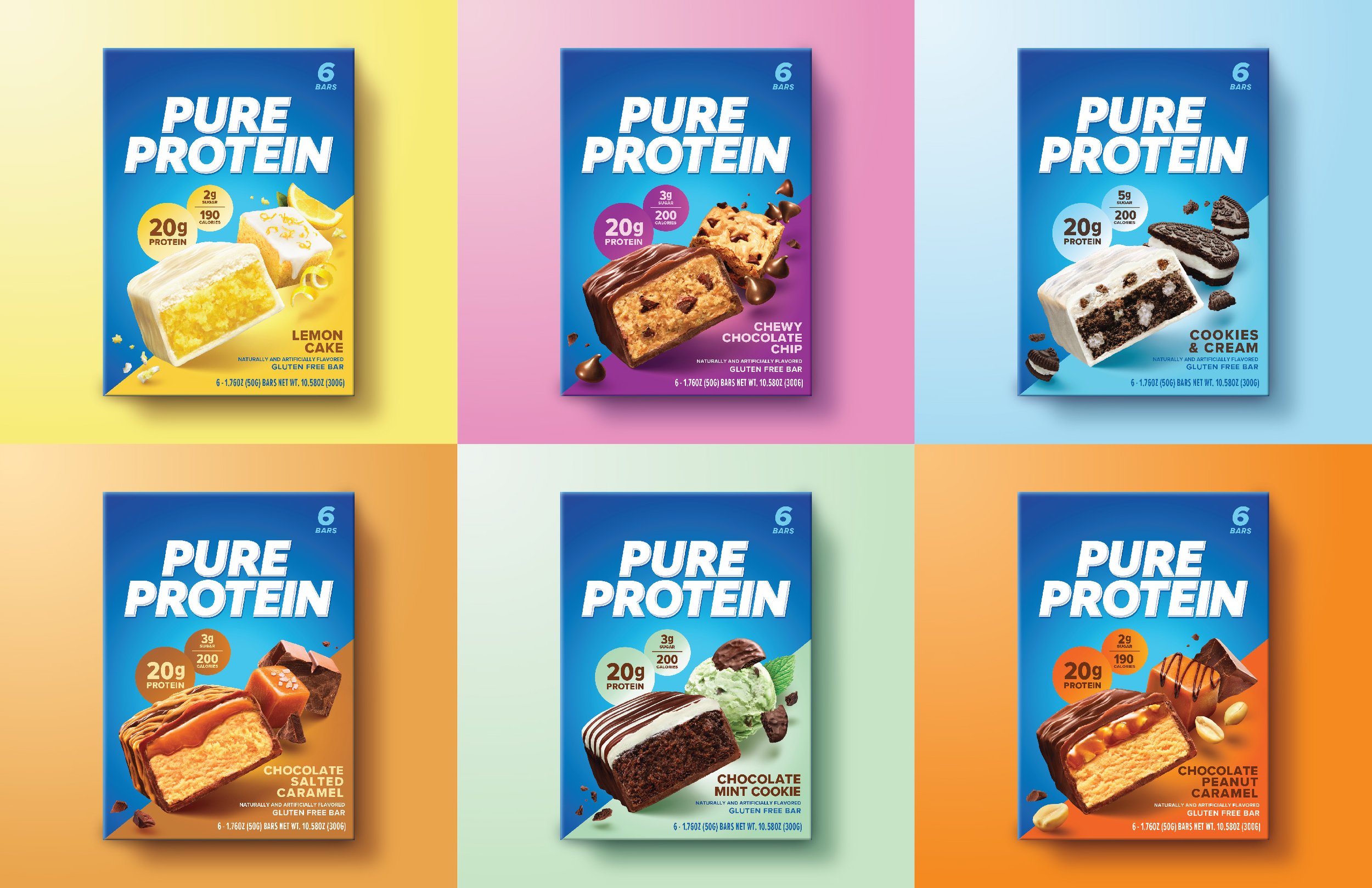
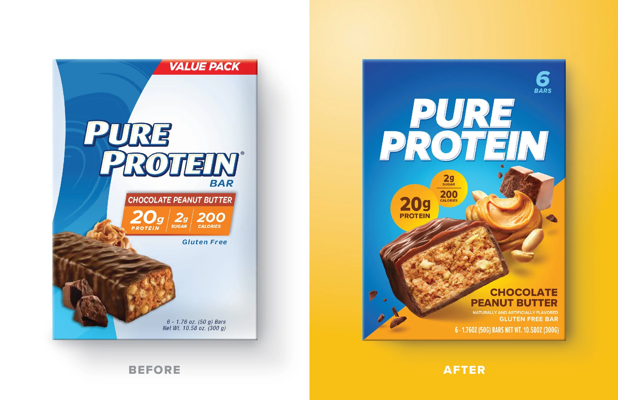
As a long-time leader in the protein category, Pure Protein sought a refreshed identity to evolve from a gym-focused brand into a modern lifestyle brand. Our team was given broad creative freedom to modernize the look while honoring its heritage and setting the stage for future flavor and product line expansions.
The resulting design system embodies the idea of “Energized Nutrition,” using dynamic food photography, bold color, expressive typography, and graphic energy to create powerful impact both on shelf and in e-commerce.
Results & Recognition
2024 Designalytics Effectiveness Award Winner for 18%+ sales growth post redesign
Featured on Dieline - “After Almost Three Decades, Pure Protein Undergoes A Packaging Update”
“Pure Protein really pumped up its performance with this new design, as consumers preferred it to the previous version, 68% to 32%.”
“[The new design has] an eye-popping leap of 51 points (74% vs. 23% for the new design) in “tastes great,” which is—surprise, surprise—the number-one most important attribute in this category.”


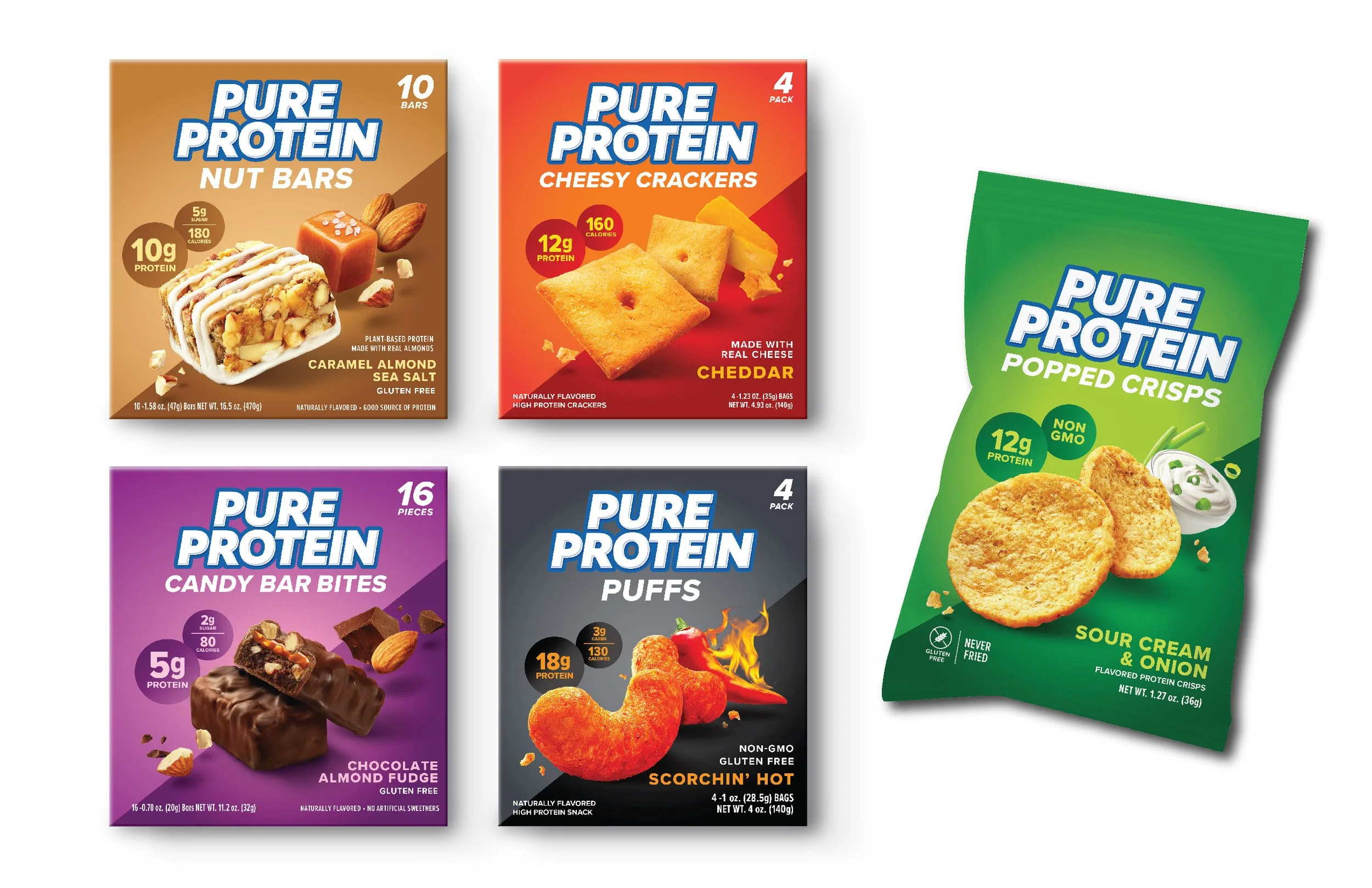
Savory Snacks

Powder & Ready-to-Drink Shakes

Core Protein Bars

Final Club Packs in Costco
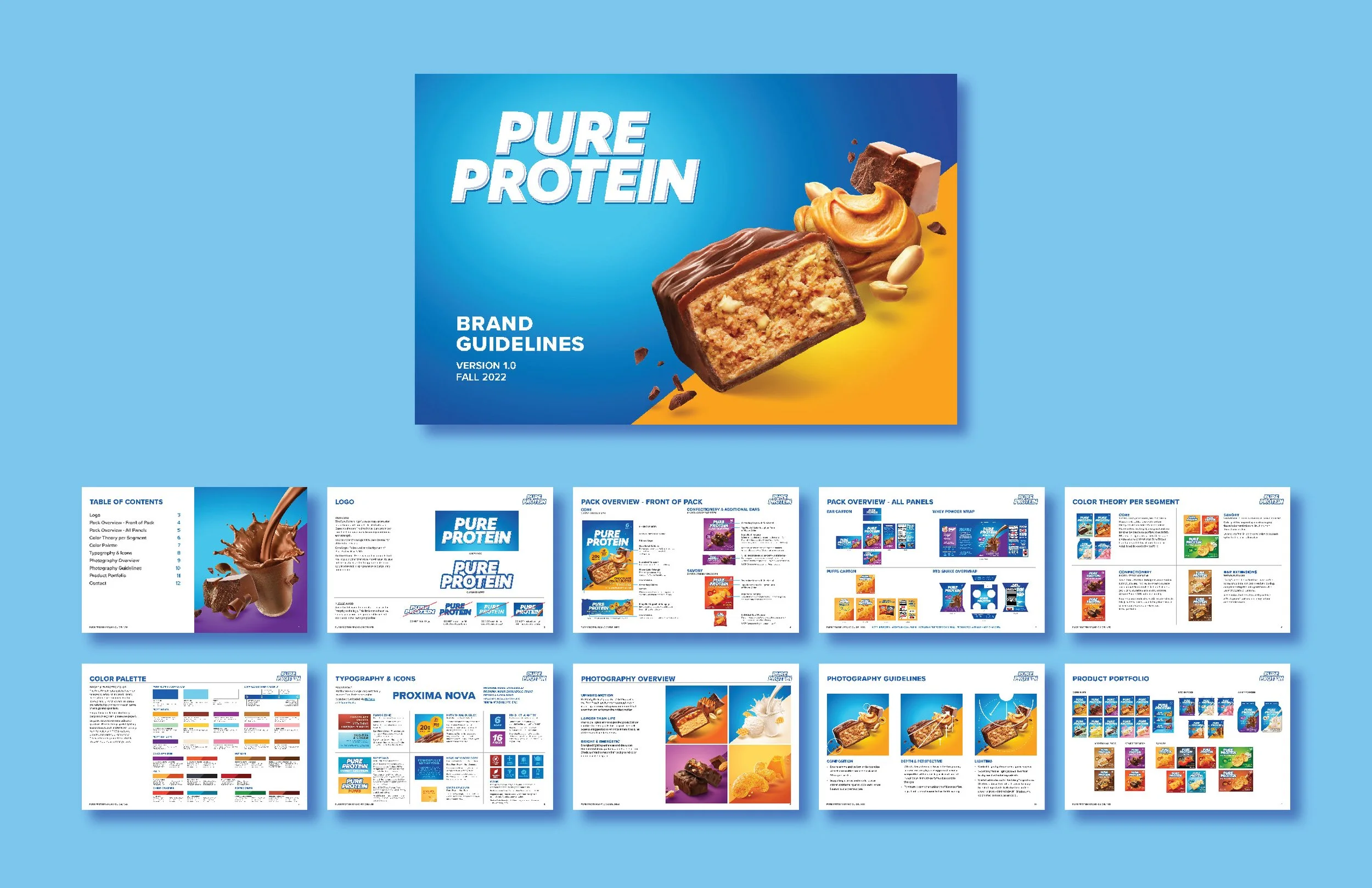
Mini-guidelines

Photoshoot Process
Our team partnered with photographer TJ Vissing of OMS Photography in Cincinnati, OH for a multi-leg shoot spanning 29 SKUs. I worked closely with the photography and retouching team both on-set and virtually to deliver flexible artwork for packaging and off-pack touchpoints.
Video clip of me collaborating on set from Pure Protein social media.


NOTE: Please do not distribute any materials displayed on this portfolio page. The designs showcased are created for demonstrative purposes only and are the intellectual property of their respective owners. I do not claim ownership of any of the displayed designs, unless otherwise specified, nor do I claim to represent the client.